
Clear, Opal, or Bronze? How Polycarbonate Sheet Colour Affects Light, Heat, and Glare
Colour isn't a cosmetic choice on a polycarbonate roof — it changes light transmission, solar heat gain, and glare. Here's how to pick clear, opal, or bronze for your project.
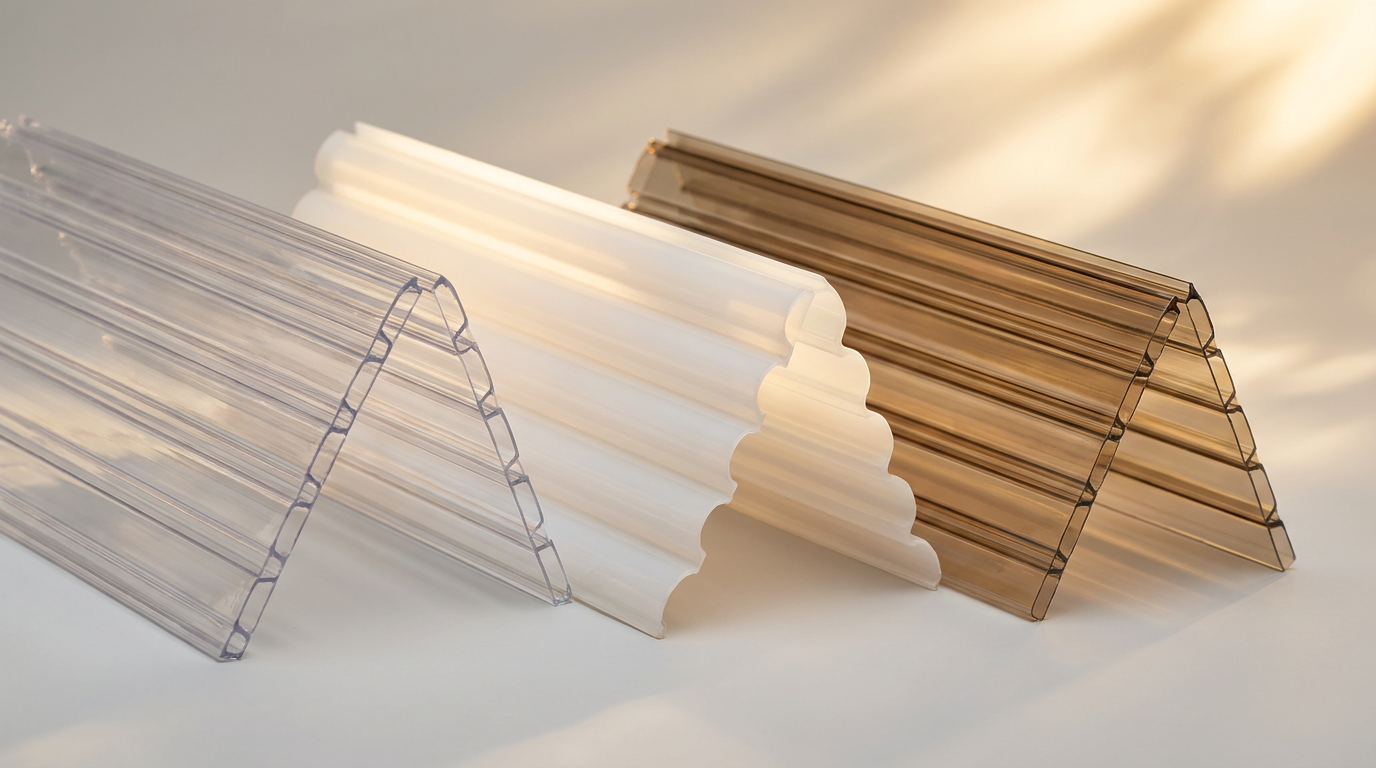
Panel colour is usually the last decision made on a polycarbonate roofing or facade order — often chosen for how it looks in a rendering rather than how it performs. That's a mistake. Colour is one of the few variables that simultaneously changes three things buyers care about most: how much light gets in, how much heat comes with it, and how comfortable the space feels underneath. Get it wrong and you end up with a beautifully lit space that's unbearably hot, or a cool space that's too dim to be useful.
This guide explains what each common polycarbonate colour actually does, and how to match tint to application.
Light Transmission and Heat Gain by Colour
As we explain in our U-value, light transmission, and lux guide, light transmission (LT) is a fixed panel property measured under standard test conditions. Colour is the single biggest lever that changes it.
| Colour | Typical light transmission | Relative solar heat gain | Character of light |
|---|---|---|---|
| Clear | 78–86% | Highest | Direct, sharp — highest glare risk |
| Opal / diffused white | 55–68% | Moderate | Soft, evenly scattered — minimal hotspots |
| Bronze / smoke grey | 35–48% | Lowest | Warm, shaded — noticeably cooler underneath |
These figures vary by thickness and manufacturer, but the pattern holds across the industry: darker and more diffused colours consistently trade light quantity for heat control and comfort. Bronze panels can cut solar heat gain by close to half compared to clear sheet of the same thickness — a meaningful number if you're also chasing a lower U-value on the same roof.
Clear: Maximum Daylight, Maximum Responsibility
Clear polycarbonate delivers the most daylight per square metre of any colour option, which makes it the obvious first choice for daylight-hungry spaces — warehouses, sports halls, cold storage, industrial sheds. But high LT without diffusion is exactly the combination we warn about in our glare guide: direct, undiffused clear panels create sharp hotspots and glare that can make a space uncomfortable to work in, even though the average lux reading looks excellent.
Clear is the right choice when the space genuinely needs maximum light and glare isn't a major concern — think logistics warehouses with high roofs and no fixed workstations directly under the skylight. It's a riskier choice for offices, classrooms, or any space with screens and desks.
Opal: The Default Recommendation for Most Buildings
Opal (diffused white) panels scatter incoming light across their internal cell structure before it reaches the occupied space, which is why we recommend it as the starting point for the majority of daylighting applications — the same logic that makes diffused panels the standard choice for the greenhouse and poly house applications we've covered separately. Opal trades some raw LT for a dramatically more even, glare-free light distribution.
For schools, hospitals, offices, and retail spaces — anywhere people spend sustained time under the roof — opal or another diffused finish is almost always the better starting specification than clear, even though clear tests higher on a spec sheet.
Bronze and Smoke: Heat and Privacy Control
Bronze, smoke grey, and similar dark tints are the right call when heat gain or visual privacy matters more than raw light quantity — west- and south-facing facades in hot climates, carports and parking shades where reducing cabin heat matters, and any application where a lighter, cooler ambience is preferred over maximum brightness.
The tradeoff is straightforward: less light comes through. On a roof that's already daylight-generous — say, one with a high roof-to-floor ratio — bronze can bring lux levels down to a comfortable range without needing internal shading. On a smaller opening, bronze can leave a space feeling dim. Check your target lux level against the panel's rated LT before committing, ideally with a daylight simulation for anything beyond a small residential application.
Matching Colour to Orientation
Colour choice should follow the same orientation logic covered in our skylight orientation guide:
- North-facing (in the northern hemisphere context Indian buildings sit in): Consistent, low-glare light — clear or lightly diffused panels work well since direct sun exposure is limited.
- South-facing: Higher and more variable sun angles through the day — opal or diffused panels reduce the risk of moving hotspots.
- East- and especially west-facing: Low sun angles create the sharpest glare and highest instantaneous heat load — bronze or heavily diffused panels are usually the better default here, particularly on west elevations catching afternoon sun.
Does Colour Affect Long-Term Yellowing?
Colour itself doesn't determine UV durability — that's governed by the co-extruded UV protection layer, covered in detail in our UV yellowing guide. But because yellowing shows up as a colour shift, it's more visually obvious on clear panels than on bronze or opal ones, where a slight tint change blends into the existing colour. Don't mistake "less visible yellowing" on a tinted panel for "better UV protection" — always ask for the UV layer specification separately from the colour choice.
Quick Reference: Colour by Application
| Application | Recommended starting colour |
|---|---|
| Warehouse / industrial shed roof | Clear or lightly diffused |
| School / hospital / office skylight | Opal / diffused |
| Home skylight or pergola | Opal for general use; clear only with shading |
| Parking shed / carport | Bronze or opal, depending on desired brightness |
| West-facing facade | Bronze or smoke grey |
| Greenhouse / poly house | Diffused / opal |
Coxwell manufactures polycarbonate systems in clear, opal, bronze, and custom tints, with tested light transmission and solar heat gain data for every colour and thickness. Talk to our team about the right colour specification for your project's orientation and climate.
Frequently asked questions
What's the difference between clear and opal polycarbonate sheets?
Clear sheet has the highest light transmission (typically 78-86%) but lets direct, undiffused light through, which can create glare and hotspots. Opal (diffused) sheet has somewhat lower light transmission (55-68%) but scatters light evenly, avoiding hotspots and glare — making it the better default for occupied spaces like offices and schools.
Does bronze polycarbonate reduce heat significantly?
Yes. Bronze and smoke-tinted polycarbonate typically cuts solar heat gain by roughly half compared to clear sheet of the same thickness, while also reducing light transmission to around 35-48%, making it a common choice for west-facing facades and parking shades.
Which polycarbonate colour is best for a home skylight?
Opal is the safer default for most home skylights and pergolas because it diffuses light evenly without glare. Clear can work well if the skylight also has shading or is oriented away from direct afternoon sun.
Does polycarbonate colour affect how quickly it yellows?
No — long-term UV durability is governed by the co-extruded UV protection layer, not the panel colour. Yellowing is simply less visually obvious on tinted panels than on clear ones, so always check the UV protection specification separately from colour.
Next step
Speak to a Coxwell engineer.
Our team can help you specify the right system, review your BOQ, or answer technical questions about your project.